Introduction
Choosing a colour palette for your home can feel overwhelming. With thousands of paint colours available and countless combinations possible, where do you even begin? The good news is that creating a cohesive colour scheme isn't about following rigid rules, it's about understanding a few key principles and trusting your instincts.
At Vertigo Interiors, we've guided hundreds of clients through this process. This guide shares the framework we use to help homeowners create colour palettes that feel both personal and professionally polished.
Understanding Colour Theory Basics
Before diving into specific colours, it helps to understand how colours relate to each other. The colour wheel isn't just for art students, it's a practical tool for creating harmonious schemes.
Primary, Secondary, and Tertiary Colours
- Primary colours (red, blue, yellow) form the foundation
- Secondary colours (orange, green, purple) are created by mixing primaries
- Tertiary colours fill in the gaps between primary and secondary
Warm vs Cool Tones
Every colour has undertones that lean warm (yellow, orange, red) or cool (blue, green, purple). Mixing warm and cool tones can create tension, sometimes desirable, sometimes not. Understanding undertones helps you choose colours that work together naturally.
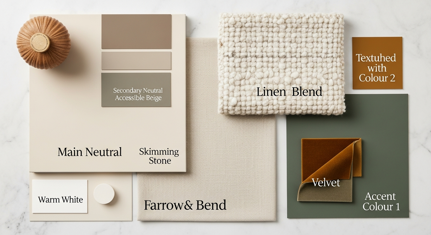
The 60-30-10 Rule
One of the most reliable formulas for balanced colour schemes is the 60-30-10 rule:
- 60% dominant colour (typically walls and large furniture)
- 30% secondary colour (upholstery, curtains, accent furniture)
- 10% accent colour (accessories, artwork, cushions)
This ratio creates visual hierarchy and prevents any single colour from overwhelming the space.
Starting Points for Your Palette
Option 1: Start with Something You Love
Do you have a piece of art, a rug, or a fabric that makes your heart sing? Use it as your starting point. Pull colours directly from this piece to build your palette. This method ensures your scheme feels personal and meaningful.
Option 2: Consider the Light
The quality of natural light in your space dramatically affects how colours appear. North-facing rooms in Edinburgh receive cool, consistent light, warm colours can help counterbalance this. South-facing rooms get warmer light, making them more forgiving of cool tones.
Option 3: Look to Architecture
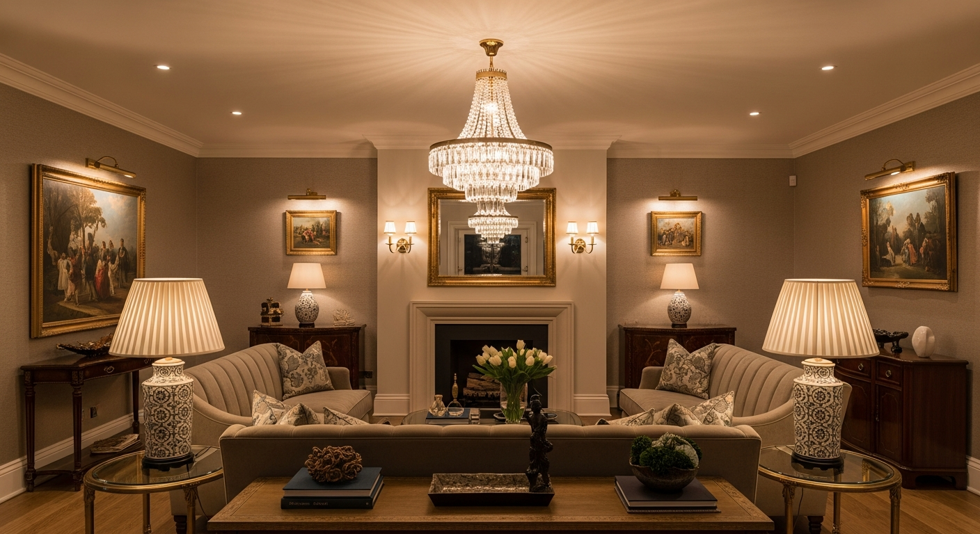
Your home's architectural features offer natural colour inspiration. Georgian townhouses with ornate cornicing suit sophisticated, muted palettes. Victorian properties can handle richer, more dramatic colours. Modern builds often shine with clean, contemporary schemes.
Common Colour Palette Approaches
Monochromatic
Using various shades of a single colour creates a serene, sophisticated effect. The key is contrast, combine very light and quite dark versions of your chosen hue to avoid flatness.
Analogous
Choosing colours that sit next to each other on the colour wheel (like blue, blue-green, and green) creates harmony with gentle variety. This approach feels natural and easy on the eye.
Complementary
Pairing colours from opposite sides of the wheel (like blue and orange) creates energy and visual interest. Use this approach sparingly, perhaps a neutral base with complementary accents.
Testing Your Choices
Never commit to a colour without testing it in your actual space. Paint large swatches (A3 minimum) on multiple walls. Observe them throughout the day and in artificial light. Live with them for at least a week before deciding.
Professional tip: Paint your test swatches on large pieces of card that you can move around the room. This lets you see how the colour interacts with different areas and lighting conditions.
Common Mistakes to Avoid
- Choosing colours from tiny paint chips, they always look different at scale
- Forgetting about fixed elements like flooring and tiles
- Selecting colours in the shop rather than your home
- Ignoring the colour of your furniture when planning walls
- Rushing the decision, good colour choices take time
When to Seek Professional Help
While many homeowners successfully choose their own colours, some situations benefit from professional guidance:
- Open-plan spaces where colour must flow between areas
- Historical properties with specific architectural considerations
- When you want a bold scheme but fear getting it wrong
- If previous attempts haven't achieved the result you wanted
Conclusion
Choosing a colour palette is one of the most impactful decisions you'll make for your home. Take your time, trust your instincts, and don't be afraid to break the rules once you understand them. The best colour schemes feel inevitable, as if no other combination would work quite as well.
Need help bringing your colour vision to life? Our team would love to hear about your project.