Choosing paint colours seems simple until you're standing in front of 47 variations of white, questioning every life decision that led you to this moment. We've been there. Every designer has. The good news: there's a method to this madness.
Why Paint Colour Choice Is Harder Than It Looks
Paint is deceptive. That tiny swatch in the hardware store bears almost no resemblance to what you'll see spread across your walls. Light, surface area, surrounding colours, and even the direction your room faces all conspire to make your carefully chosen "warm neutral" look completely different than expected.
The most common mistake we see? Choosing a colour in artificial light, then being horrified when natural light reveals it to be something else entirely. That "soft grey" becomes lavender. That "warm beige" turns pink. That "crisp white" looks like mayonnaise.
Start With What You Already Have
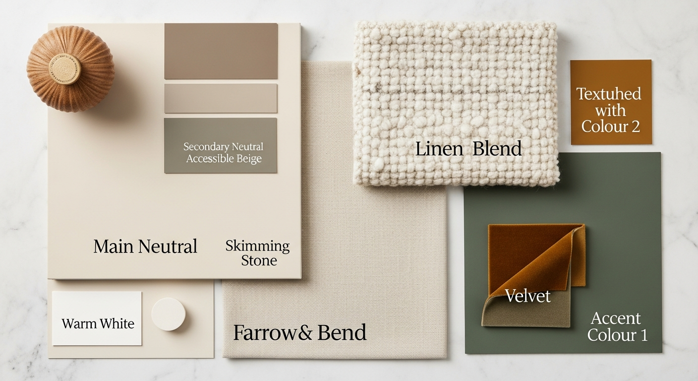
Before you even look at paint swatches, look at your room. What's staying? Your furniture, your flooring, your curtains, these are your starting point, not afterthoughts.
Pull out the dominant colours in these existing elements. If your sofa has warm undertones, your wall colour needs to play nicely with that. If your flooring has cool grey veining, introducing a warm peachy wall colour will create visual tension.
We recommend creating a physical mood board with actual samples of your existing elements. Hold fabric swatches and flooring samples next to potential paint colours. Your phone camera lies; your eyes don't.
Understanding Undertones
Every colour has an undertone, a subtle secondary colour that influences how it reads. This is where most DIY painters come unstuck.
Whites can lean yellow, pink, blue, or green. Greys can be purple, blue, green, or brown. What looks like a simple neutral in isolation reveals its true nature when placed next to other colours.
Here's a simple test: hold your potential paint swatch next to a piece of pure white paper. The undertone will suddenly become obvious. That "greige" you thought was perfectly neutral might suddenly look distinctly purple.
The Direction Your Room Faces Matters
North-facing rooms receive cool, consistent light that can make warm colours look muddy and cool colours feel icy. These rooms often benefit from warmer paint choices to counterbalance the blue light.
South-facing rooms get warm, golden light that can intensify warm tones. That cheerful yellow might become overwhelming; that subtle terracotta might turn orange.
East-facing rooms get warm morning light and cool afternoon light. West-facing rooms do the opposite. Consider when you most use the room and choose accordingly.
How to Test Paint Colours Properly
Forget those tiny tester pots dabbed on the wall. Here's what actually works:
Paint large A3-sized samples on white card or foam board. Move these around the room at different times of day. Hold them next to your existing furniture. Look at them in the morning, midday, and evening, both in natural and artificial light.
Paint at least two coats on your sample boards. Single coats rarely show true colour. And don't just look at them against your existing wall colour; that creates optical illusions.
If you're seriously considering a colour, paint a large test patch (at least one metre square) in the actual room. Live with it for a few days before committing. The cost of extra paint is nothing compared to the cost of repainting an entire room.
The Case for Safer Choices
There's nothing wrong with wanting bold colour, but if you're uncertain, err on the side of subtlety. You can always add colour through artwork, soft furnishings, and accessories, elements that are far easier to change than walls.
A well-chosen neutral isn't boring; it's versatile. It provides a calm backdrop that lets your furniture and art shine. It won't date as quickly as trend-driven colours. And it won't exhaust you after six months of living with it.
When to Call in Help
If you've tested a dozen colours and still can't commit, it might be time for professional help. Interior designers and colour consultants do this all day, every day. We can see undertones you'll miss and anticipate how colours will behave in your specific space.
A colour consultation typically costs between £150-£300 and can save you hundreds in mistaken paint purchases and the frustration of living with a colour you hate.
Summary
Choosing paint colours is genuinely difficult, and anyone who tells you otherwise hasn't done it properly. Take your time, test thoroughly, and don't be afraid to start over if something isn't working. Your walls are one of the largest surfaces in your home, they deserve more consideration than a quick decision at the paint counter.