Colour forecasting is equal parts science and intuition. Major paint companies invest heavily in trend research, tracking everything from fashion runways to economic indicators, social media aesthetics to architectural developments. The results influence the colours we see everywhere, from magazines to furniture stores, from new builds to renovation projects.
Spring 2026 brings nuanced evolution rather than dramatic revolution. The pandemic-era retreat to warm neutrals and comforting earthy tones continues, but with new sophistication and unexpected combinations. Here's what we're seeing and what it means for interior projects this year.
The Continued Rise of Warm Neutrals
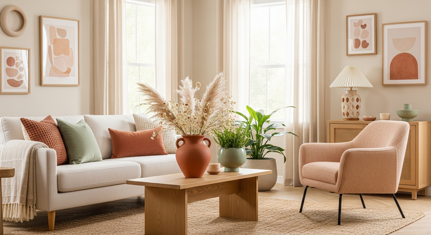
Warm neutrals remain dominant, but the palette has matured. Where 2024-2025 brought beige back from decades of ridicule, 2026 sees these colours gain complexity and regional variation.
"Greige", the grey-beige hybrid that refuses to go away, continues evolving. Current favourites lean warmer than earlier iterations, with more obvious brown undertones that suit British light better than cooler versions. Think oatmeal, mushroom, and linen rather than concrete or fog.
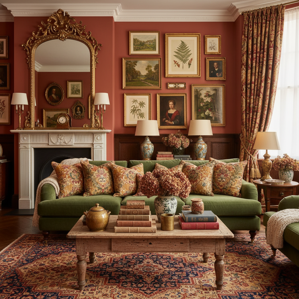
Clay tones, terracotta-influenced warm neutrals, work particularly well in period properties where historical colour research supports their use. These colours existed before the twentieth century's industrial pigments; they feel contextually appropriate in ways that synthetic hues don't.
Green's Ongoing Dominance
Green remains the accent colour of choice, though emphases shift. Dark, saturated greens (hunter, forest, bottle) that dominated recent years face competition from more complex sage and olive variations that read as almost-neutrals in certain lights.
The biophilic design movement, which connects interior spaces with nature, drives green's continued popularity. These colours reference foliage, creating psychological connections to natural environments that urban dwellers increasingly crave.
What's new: green appears more often on larger surfaces rather than accent applications. Entirely green kitchens, green bedroom schemes, green-walled living rooms, designers and homeowners are committing to green more fully rather than using it cautiously.
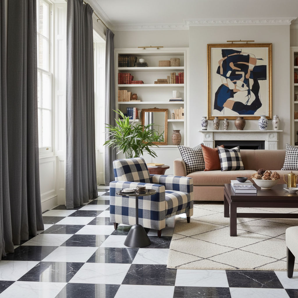
Blue's Return to Prominence
Blue had been overshadowed by green's dominance but returns to attention this season. Not the bright primary blues of earlier decades, but complex, muted variations that complement rather than compete with green palettes.
Navy remains relevant, especially in traditional contexts where its associations with permanence and quality serve well. But softer denim blues, chalky sky tones, and complex blue-greys gain ground in contemporary applications.
Blue-green tones, teal, petrol, ocean, bridge the gap between green and blue enthusiasts. These colours pair well with both warm neutrals and cooler grey schemes, making them versatile choices for rooms that connect to spaces with different colour directions.
Warm Reds and Terracotta
After years of pink dominance in warm-toned accents, deeper rust and terracotta shades emerge. These colours suit period properties particularly well, with historical precedent for their use in both Georgian and Victorian contexts.
Warm reds work effectively in small doses, a painted door, a statement chair, artwork and ceramics, without overwhelming spaces. They add energy and interest to neutral schemes without demanding complete commitment.
Full room applications remain relatively rare outside heritage contexts, but terracotta-influenced paint colours for dining rooms and studies are increasing. These spaces suit warmer, more enveloping colour treatments than living rooms where lighter feels safer.
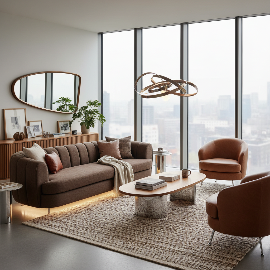
The Black Accent
Black as an interior colour continues gaining acceptance. Not for entire rooms, though that remains occasionally dramatic, but as an intentional element within lighter schemes.
Black window frames, door furniture, light fittings, and occasional furniture pieces provide structure and definition against lighter backgrounds. The effect grounds rooms that might otherwise float in pale ambiguity.
This use of black draws from Scandinavian and Japanese design traditions where contrast creates visual interest within restrained palettes. It works particularly well in contemporary spaces with minimal architectural detail, providing definition that would otherwise come from cornicing or panelling.
Texture Over Colour
A parallel trend de-emphasises colour entirely, relying instead on texture for visual interest. Off-white schemes gain richness through varied surfaces: smooth plaster against rough linen, polished stone against matte wood, glossy tiles against textured wallpaper.
This approach suits those who find colour decisions overwhelming. It creates sophisticated spaces without committing to specific hues that might date or tire. The palette can evolve by changing textured elements without repainting.
It's also practically forgiving. Slight colour variations between different whites become irrelevant when visual interest comes from texture rather than precise chromatic matching.
Regional and Cultural Influences
International travel and social media expose British design to global influences. Mediterranean terracotta and blue-white combinations. Japanese earth tones and natural materials. Scandinavian discipline and clarity. These influences inform colour choices beyond straightforward replication.
What emerges is hybrid approaches, Mediterranean warmth adapted to British light, Japanese restraint combined with British comfort, Scandinavian functionality softened for British sensibilities. Pure style copying rarely works; thoughtful adaptation creates something better suited to local context.
What This Means for Your Home
Colour trends provide inspiration, not instruction. Your home should reflect your preferences, lifestyle, and architecture, not this season's forecasts. Use trends as starting points for exploration, not prescriptions for compliance.
That said, awareness of current directions helps in several ways. It explains what's available in shops, manufacturers respond to trends, so finding trend-adjacent products becomes easier. It provides conversation points when working with designers or tradespeople. It helps anticipate resale considerations if relevant.
If you're planning a renovation, consider how colour choices might age. Extreme trend expressions date quickly; restrained interpretations have longer lives. The safest approach uses trend colours in easily-changed elements while keeping permanent features more neutral.
Getting Help With Colour
Colour selection frustrates many homeowners. The gap between expectation and reality, that perfect colour in the tin that looks entirely different on the wall, catches almost everyone at some point.
Professional colour consultations provide guidance through this complexity. We assess your light conditions, existing elements, and preferences to recommend colours that will work in your specific space. A relatively modest investment prevents expensive repainting and living with colours you don't love.
Whether you embrace 2026's directions or chart your own course, colour deserves careful consideration. It's one of the most transformative elements of interior design, and one of the most difficult to get right. We're always happy to help navigate these decisions.